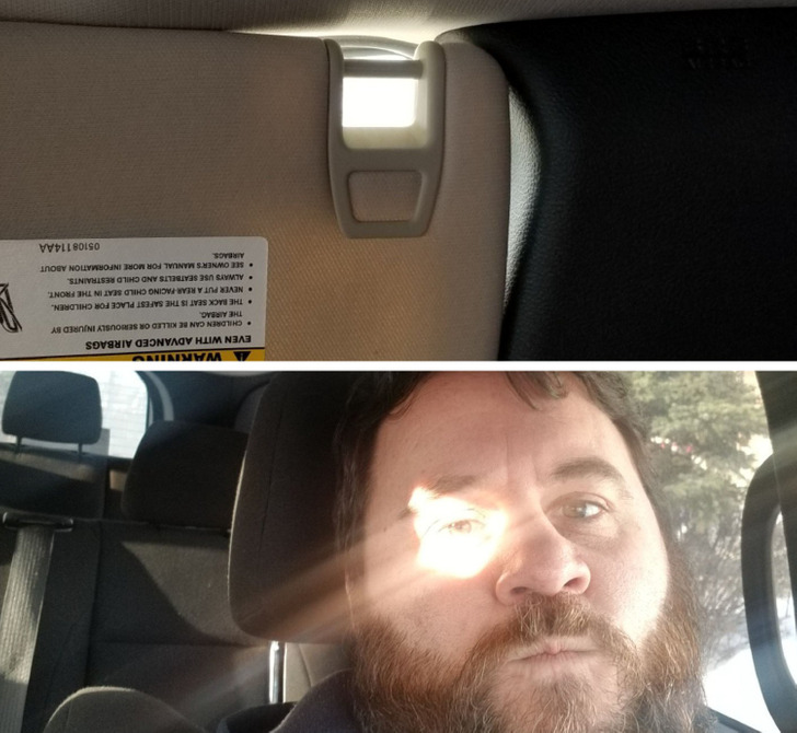
Design is a powerful process where a single detail can either make our life easier or harder. Because of that, it’s impossible to not notice when designers miss their mark. We’re immediately left with an eyesore or perhaps a risk to our well-being. Fortunately, some folks take to social media to give others a heads up or simply as a reminder to designers to double-check their plans.
Bright Side gathered a few examples of poor design that could have you laughing and raging simultaneously.
1. “Someone really did not think this through.”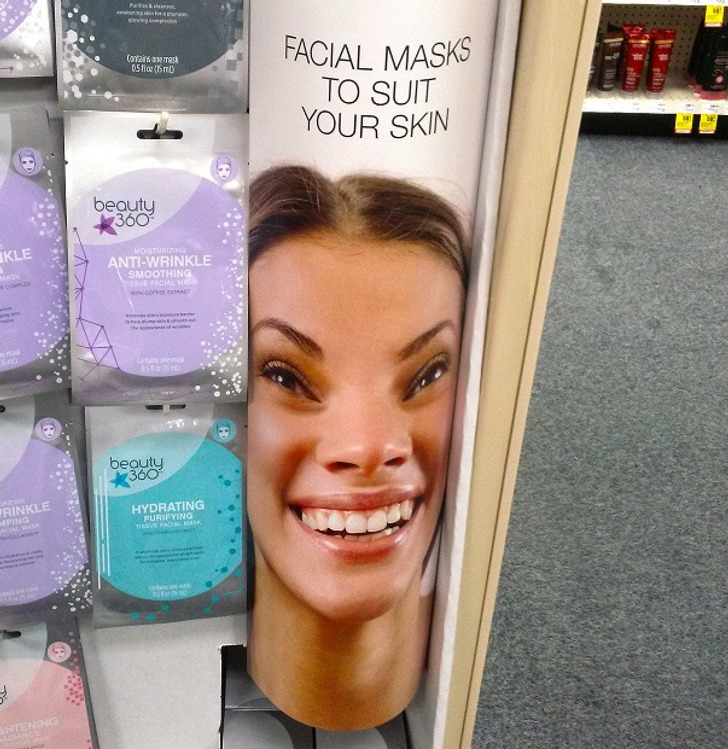
2. “Great paint job, especially that last fake step.”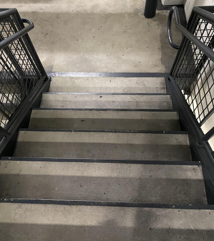
3. “I cringe every time I have to use this shower.”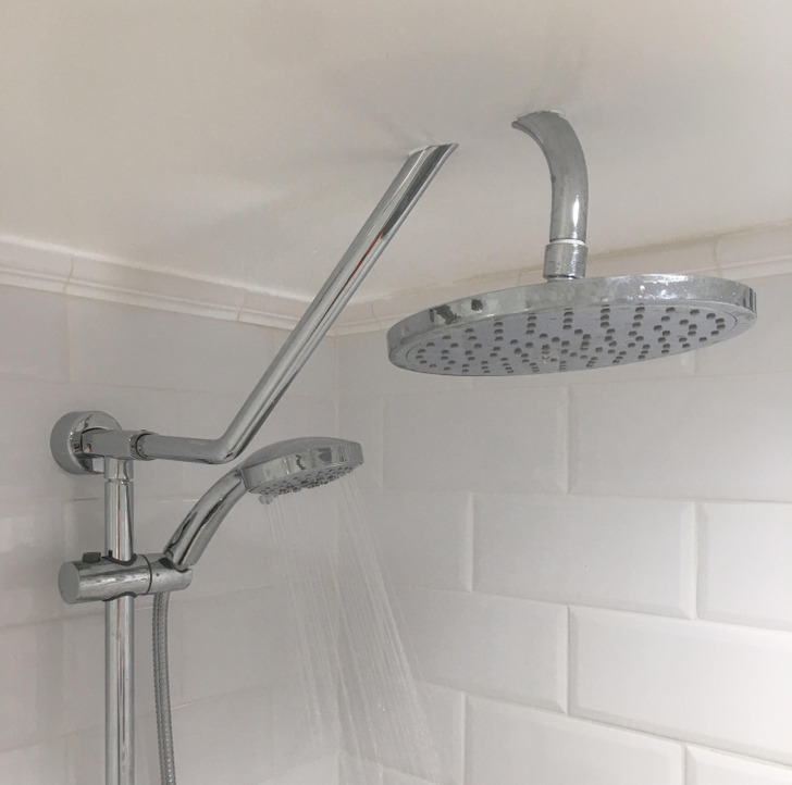
4. “The lines in this parking lot”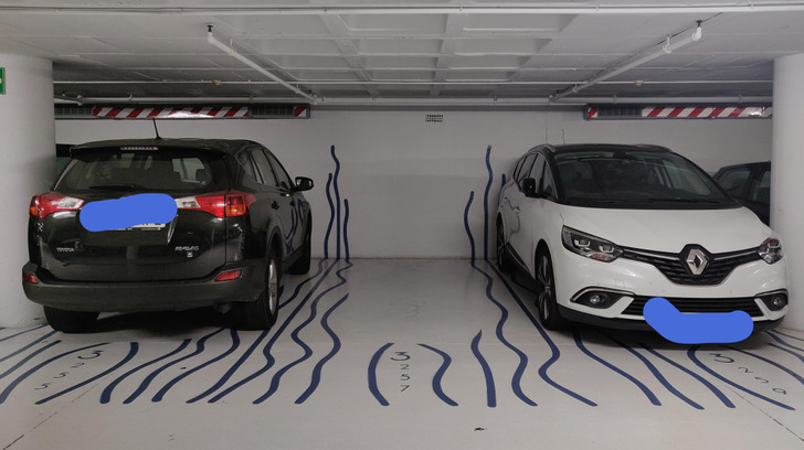
5. “I pass this billboard every day and every day I think he’s a vampire.”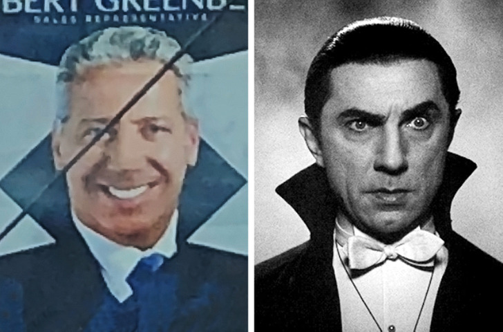
6. “I think the steak house I went to is going through an identity crisis.”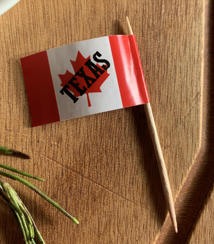
7. “I can’t be the only one who thinks this looks like protein powder.”
8. “Now I’m no expert, but I’m sure penguins don’t have human teeth.”
9. “Just wondering about how many cards have passed right through that grill on the floor.”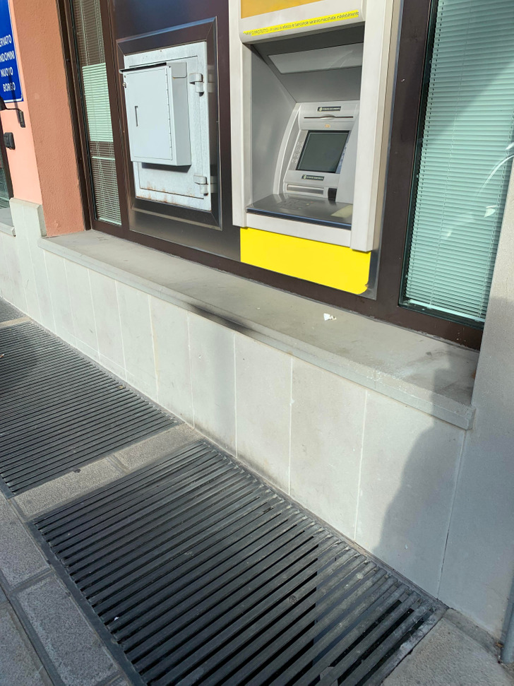
10. “My new favorite socks”
The text reads as follows: “NASA — THE NATIONAL AERONSMITH AND SPACE”
11. “The stairs in an Airbnb I stayed in where every step is a different height, width, and depth”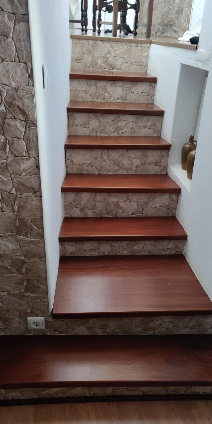
12. “These playing cards with reflective backs. Everyone at the table can see the cards you draw.”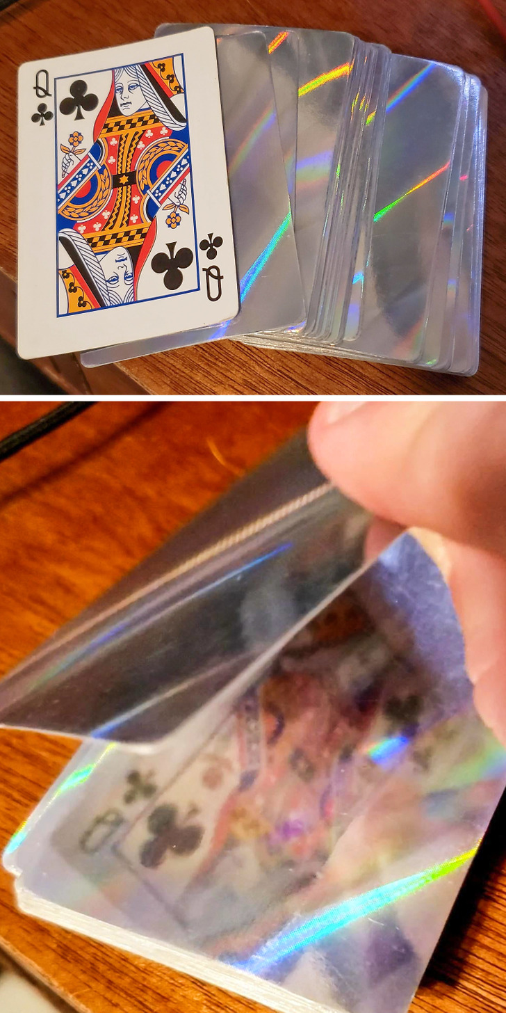
13. “This sink gives barely any space to wash your hands and it’s almost completely flat.”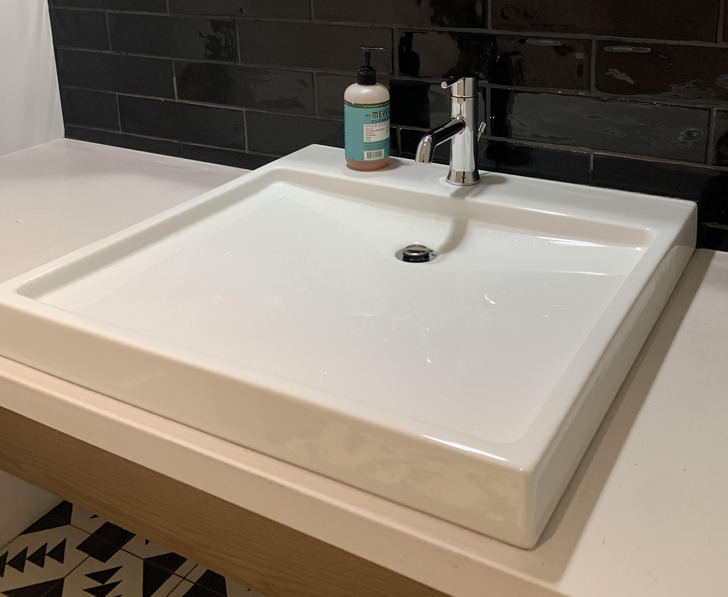
14. “Guess who washed their hands with toothpaste this morning?”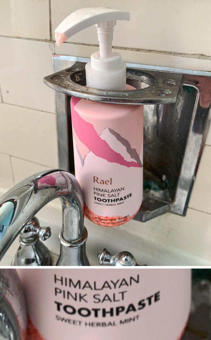
15. It doesn’t quite serve its purpose.